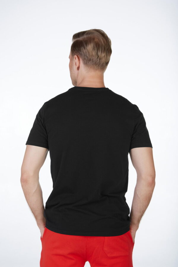
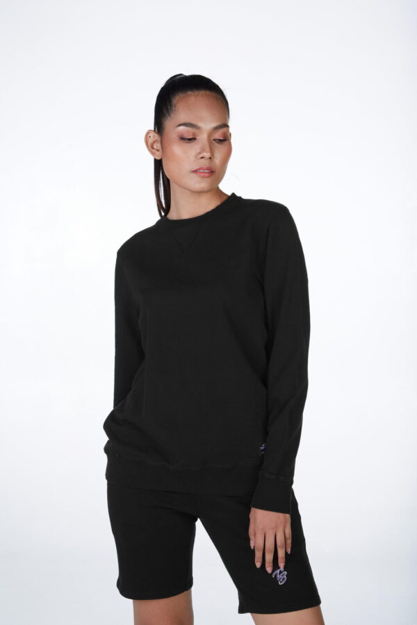
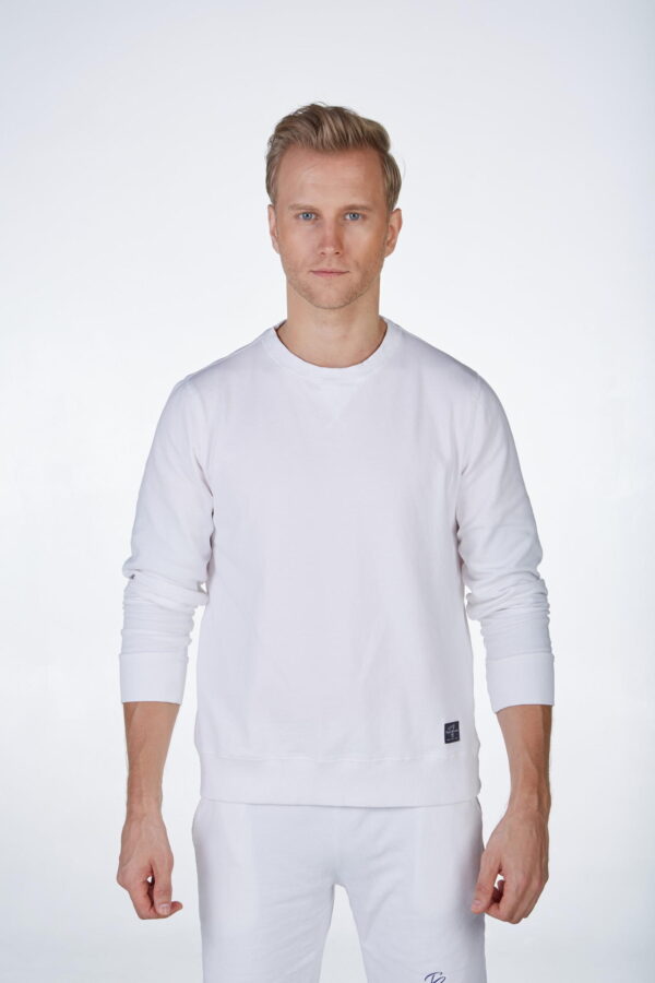
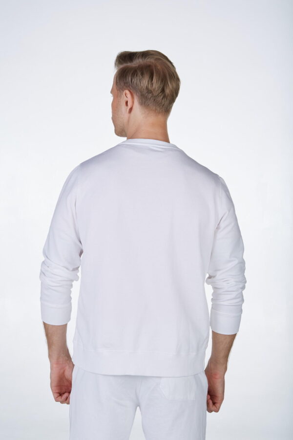
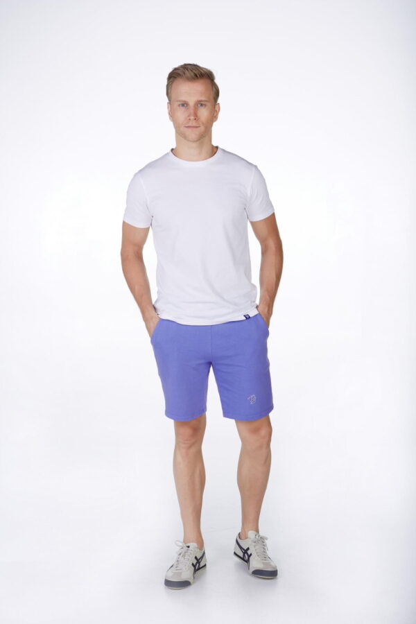
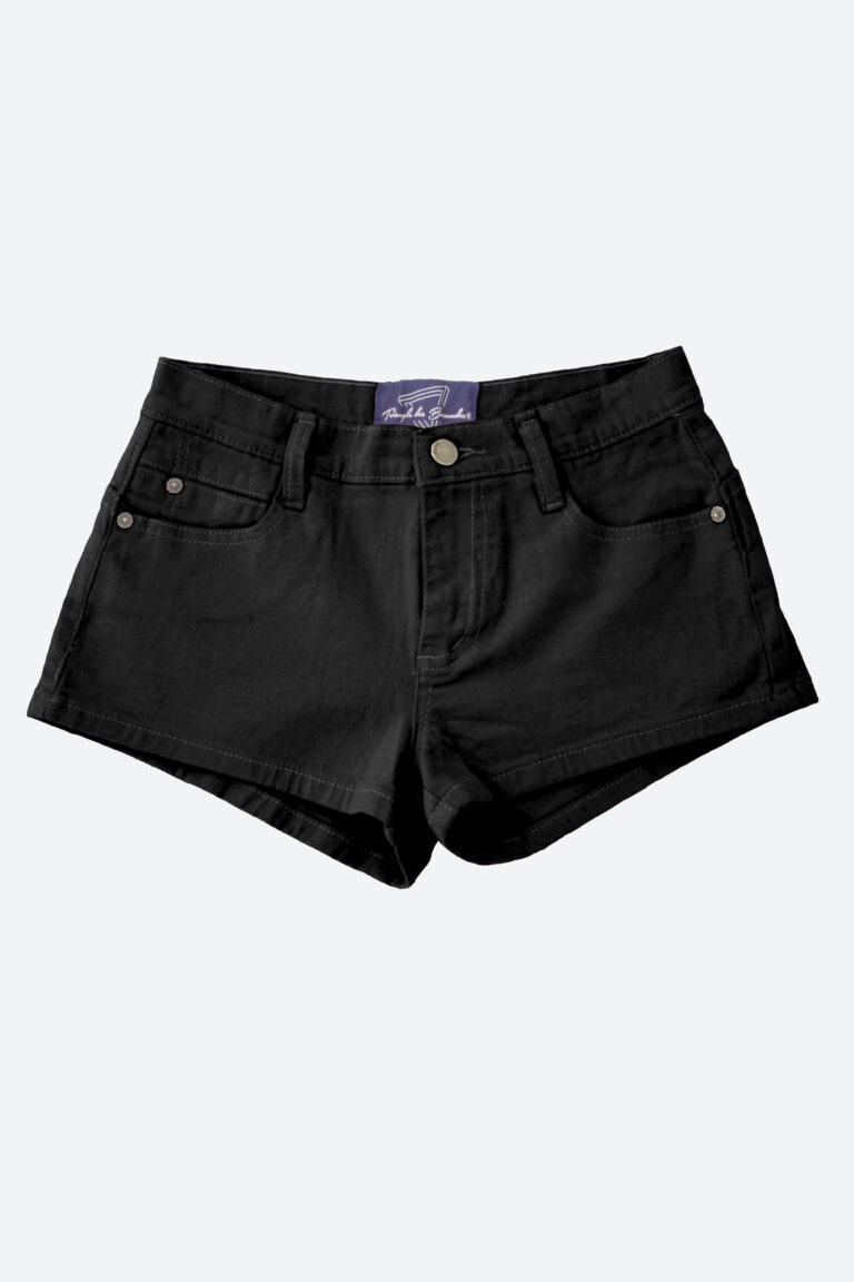
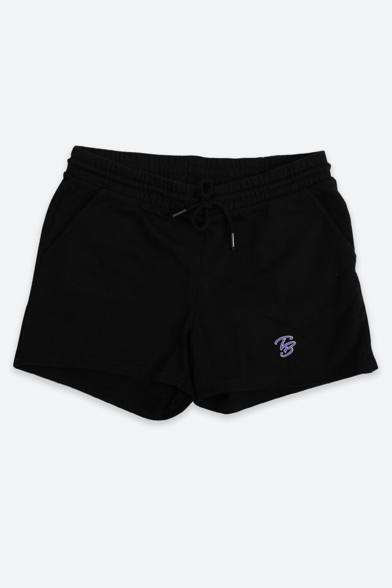
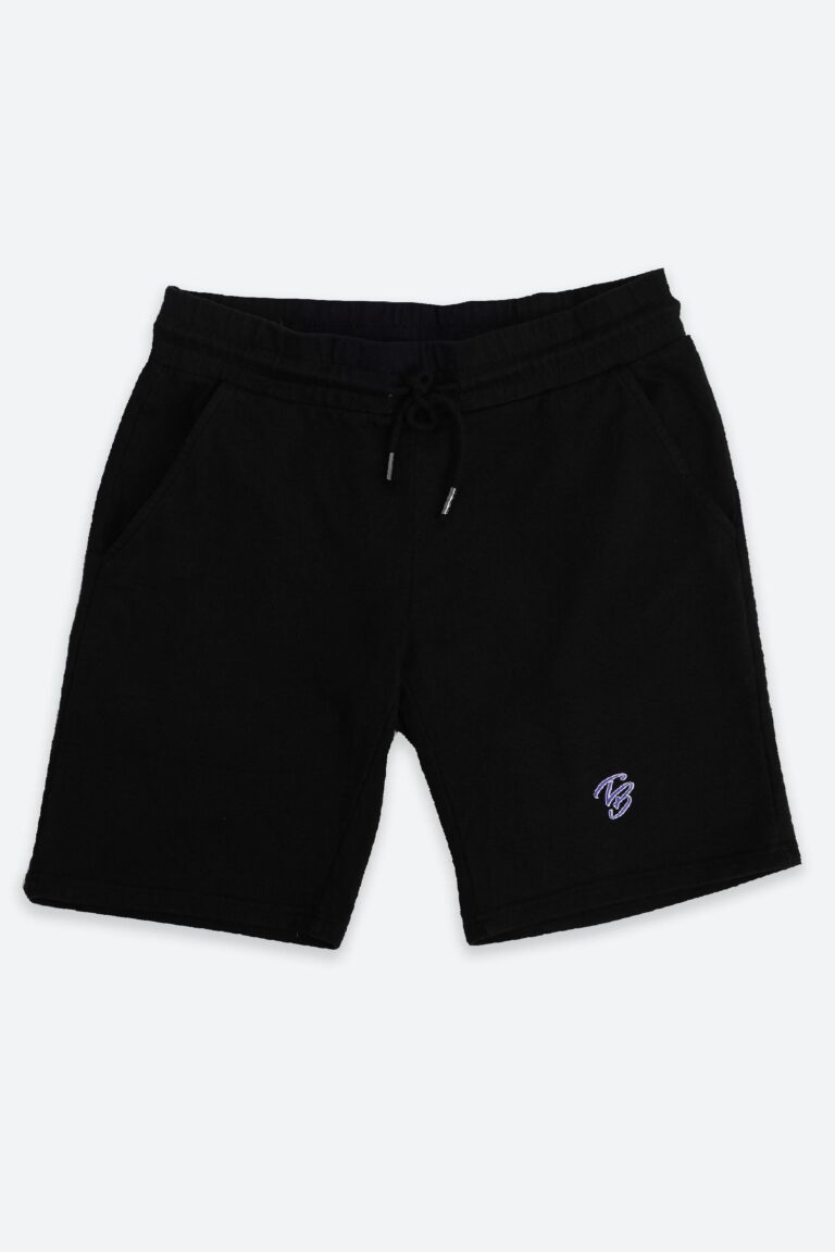
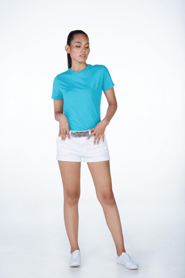
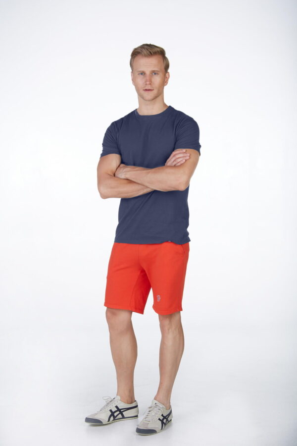
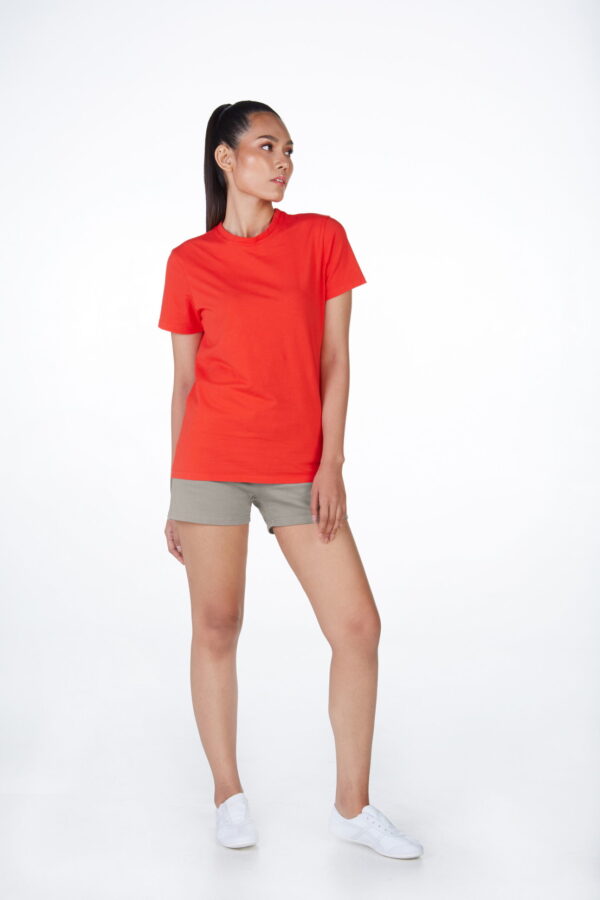
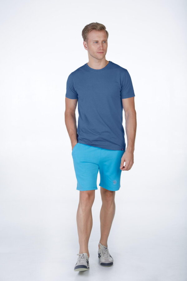
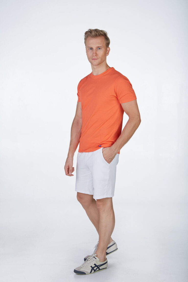
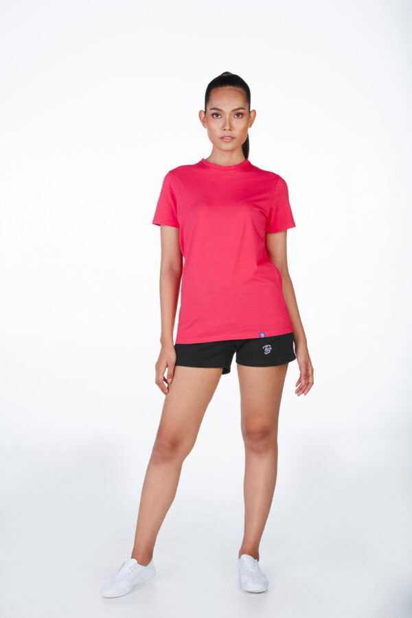
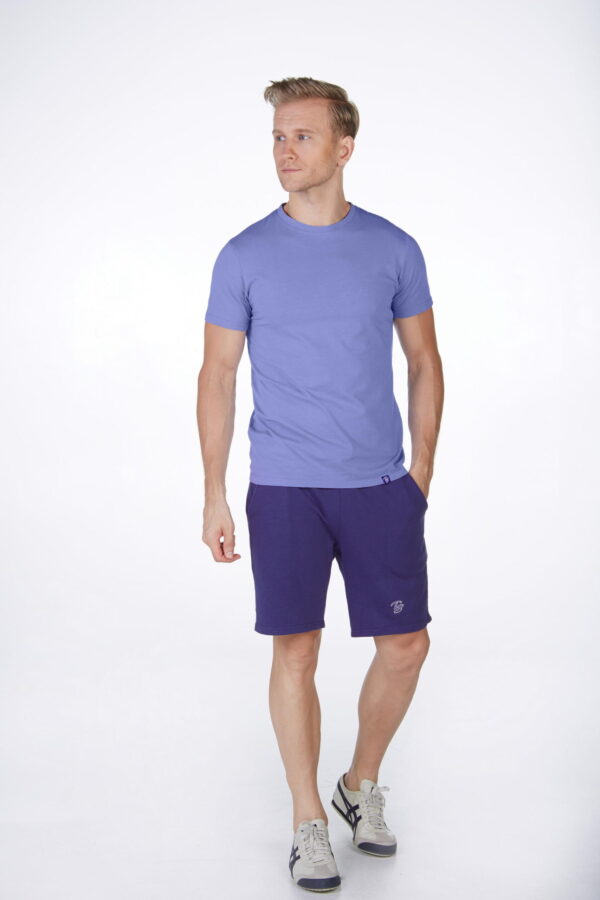
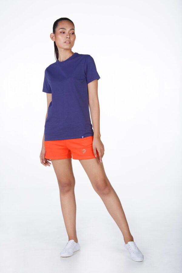
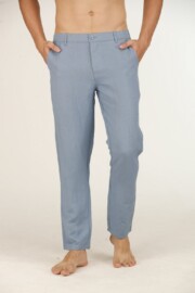
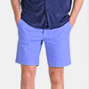
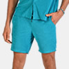
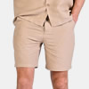
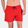
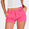
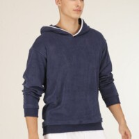
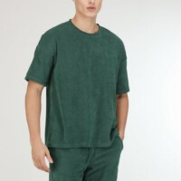
Combining colours is an essential key to style. It is even a fundamental rule not to be neglected. Even if you think you’ve found the right clothes to show off, everything can go wrong if the colours do not match. First and before explaining in detail how to associate your colours, do not forget the basic rule: light colours make you fat while dark colours give you a thin silhouette. Thanks to this article you will understand how to match the colours and you will put an end to this headache.
Do not forget that your clothes and especially colours, will be an asset to allow you to create and develop your personal style, with a clear impact on your mood, in a positive way of course. Be stylish and chic, light up your summer with perfectly mastered colourful outfits.
THE TYPES OF ASSOCIATION
Monochromatic
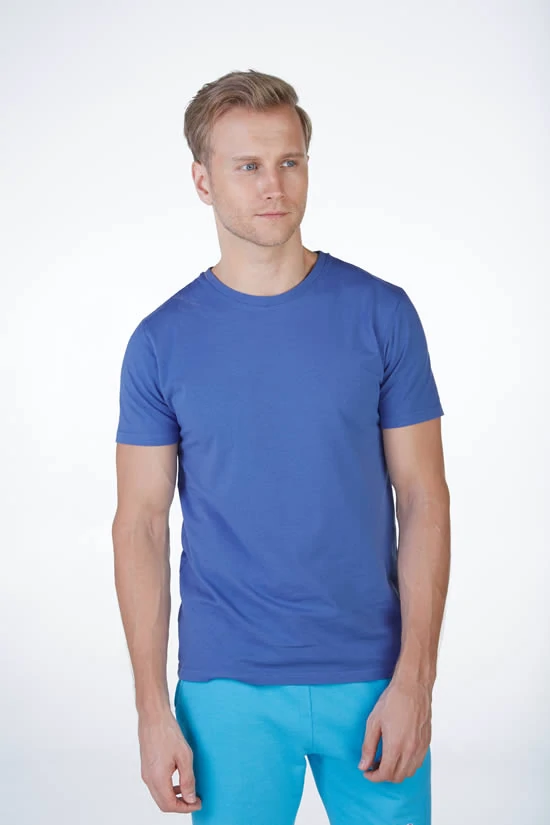
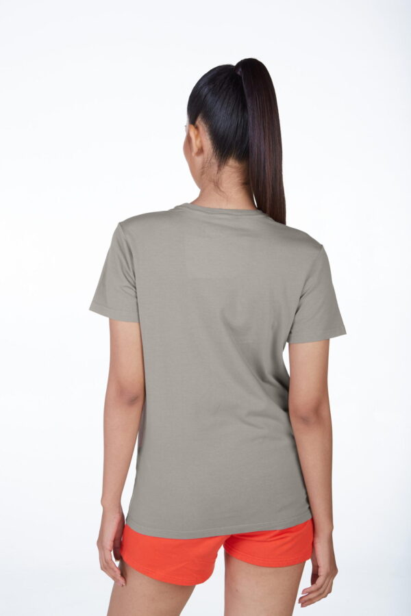
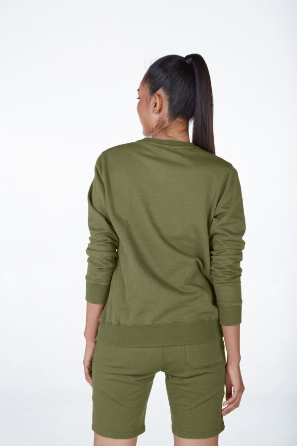
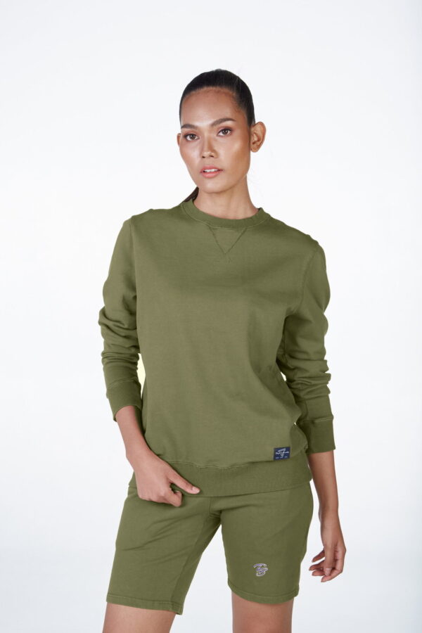
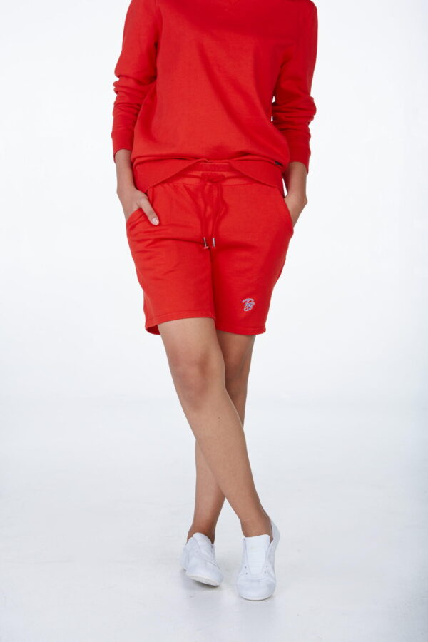
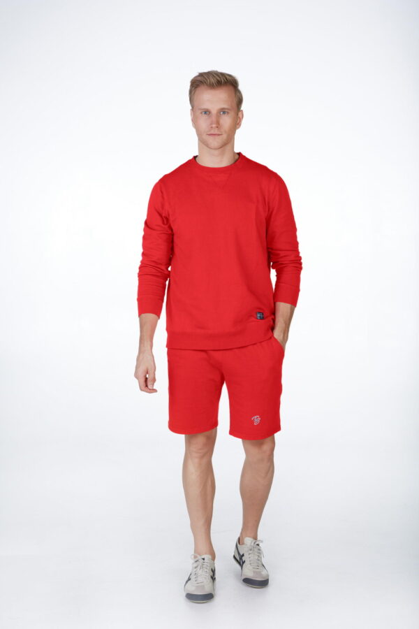
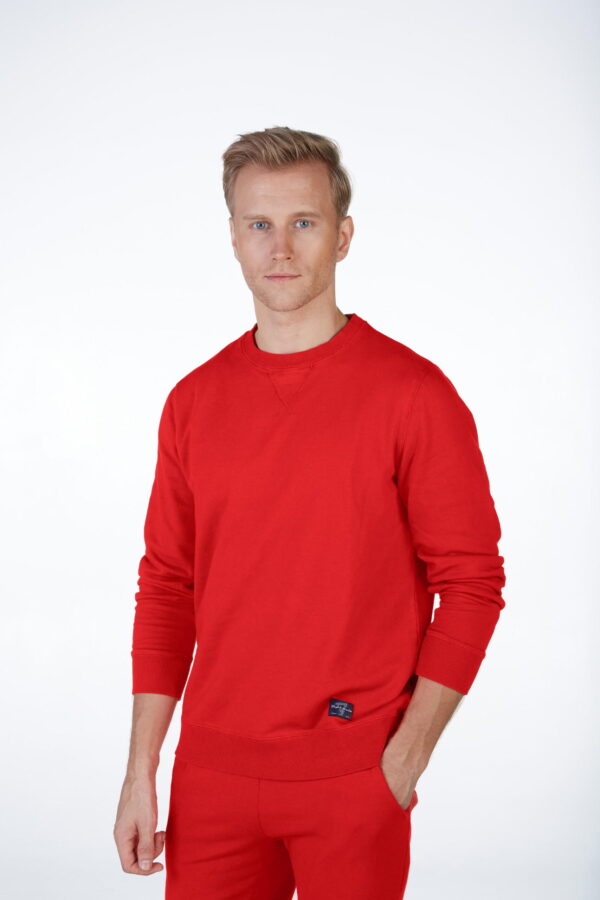
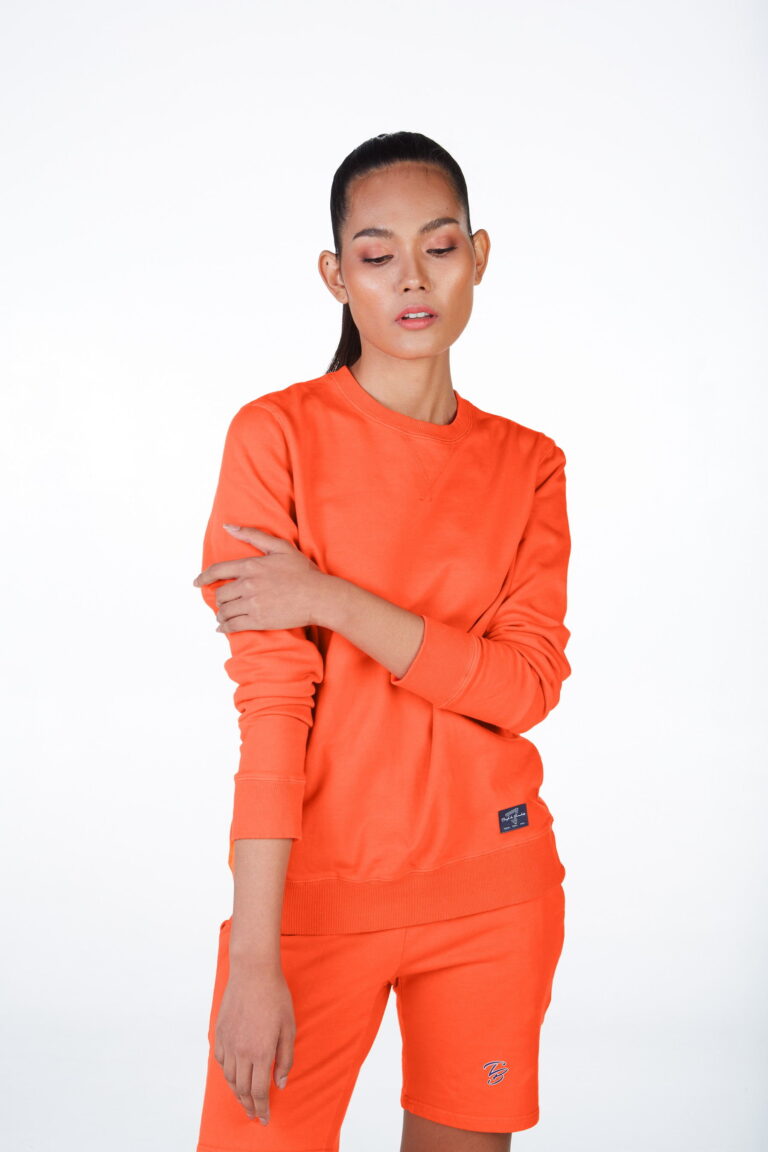
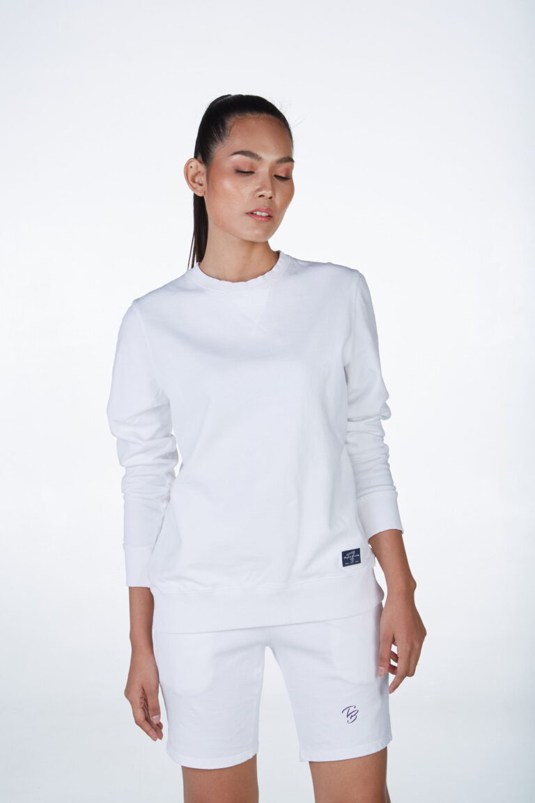
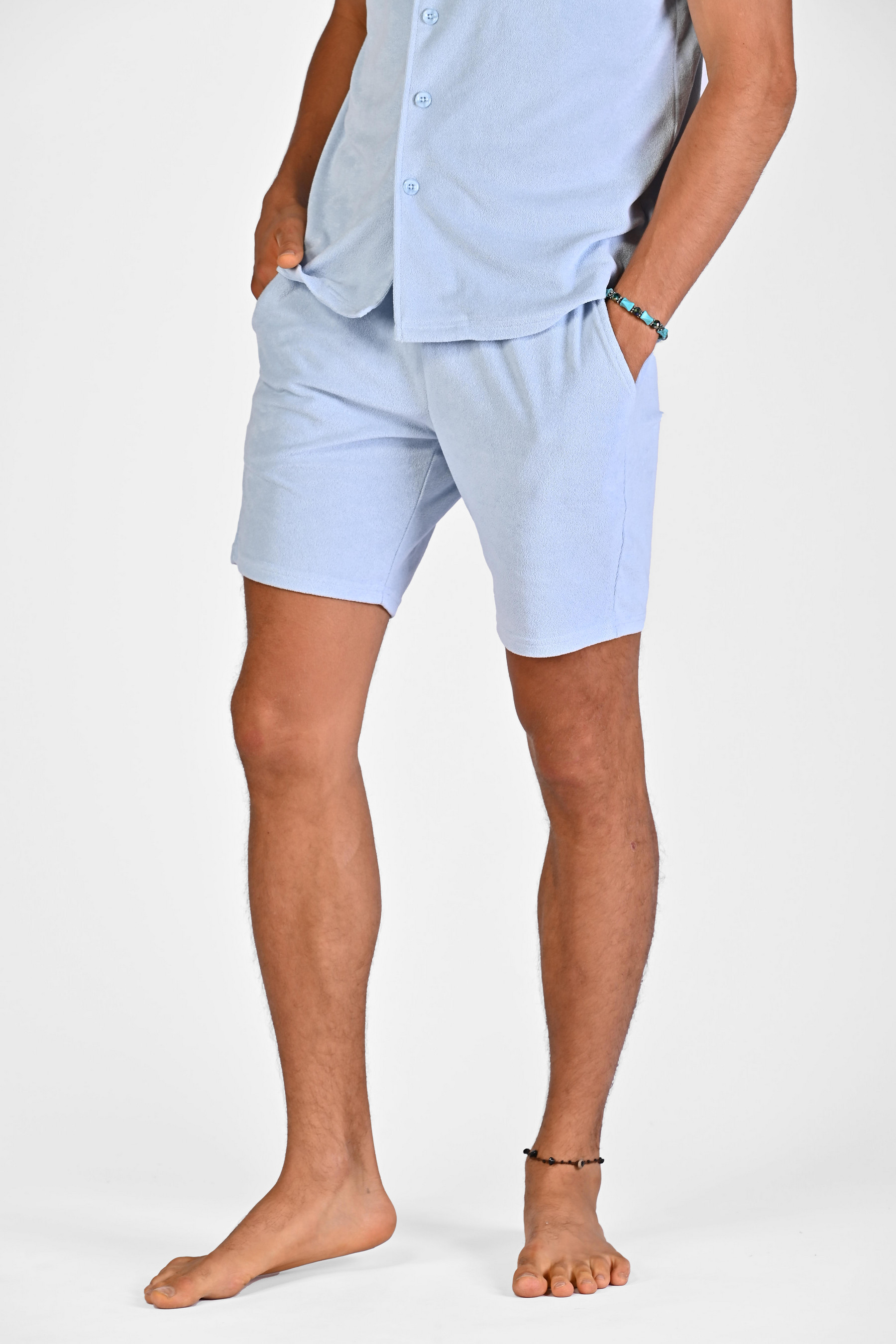
The monochromatic simply means: one colour. As a result, the outfit will be all blue, all orange, all white, etc … This style has the effect of lengthening the silhouette. The fact that your outfit is not cut by another colour will give you a sleek, slim look.
Contrasts and complementary colours
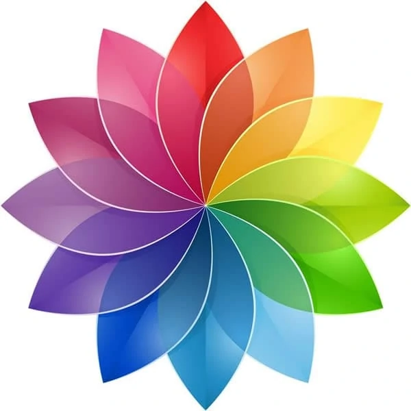
To know the complementarity of colours, the colour circle is a reference tool. This circle is composed of 3 primary colours (blue, yellow, red) and their derivatives: secondary colours, intermediate colours ….
On this circle, complementary colours are opposite each other. As a result, blue is complementary with orange. Purple Blue will be complementary with Yellow, and so on …
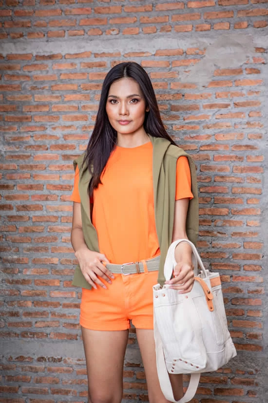
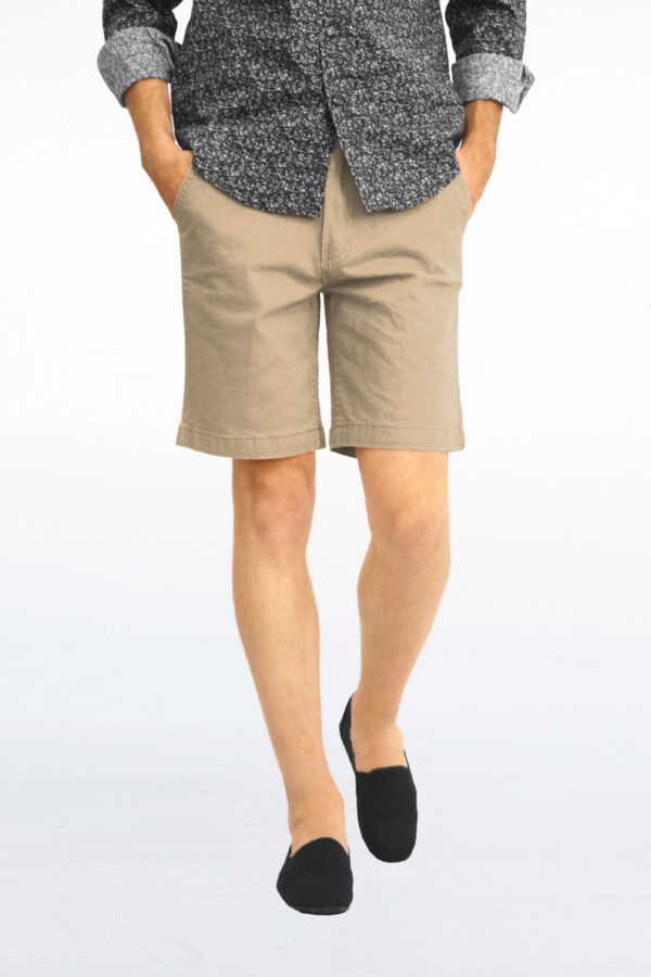
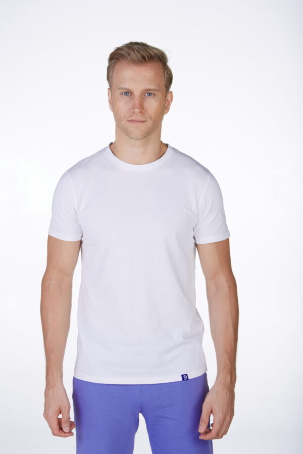
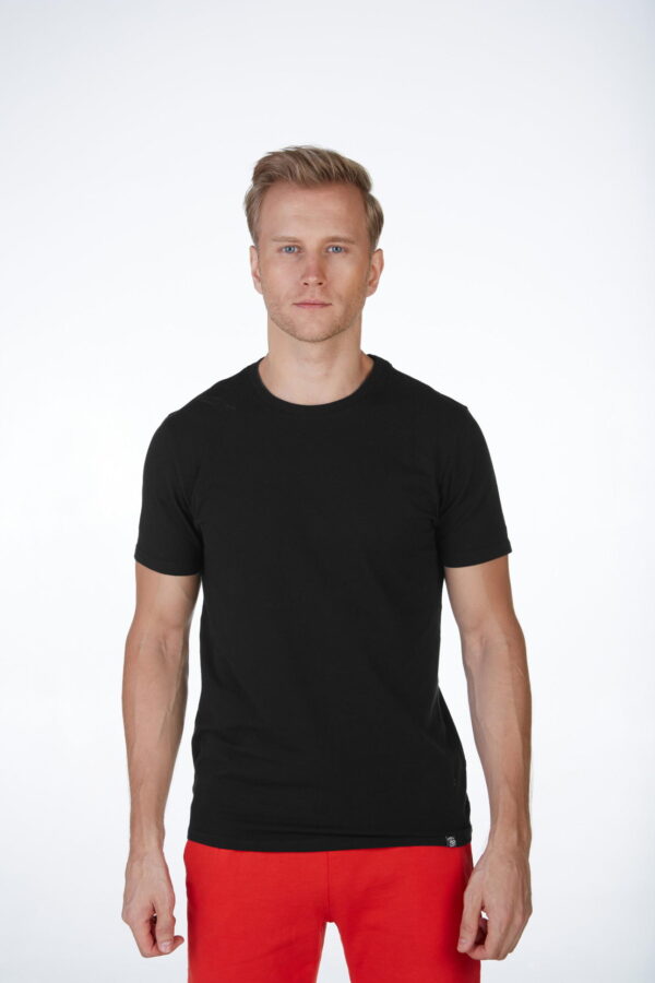
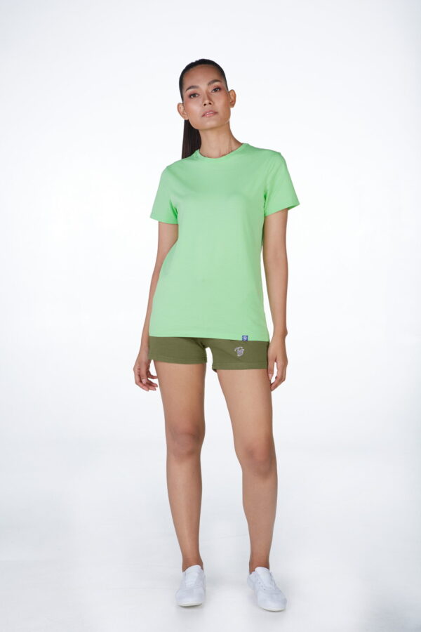
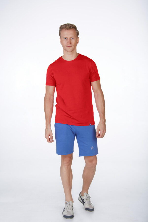
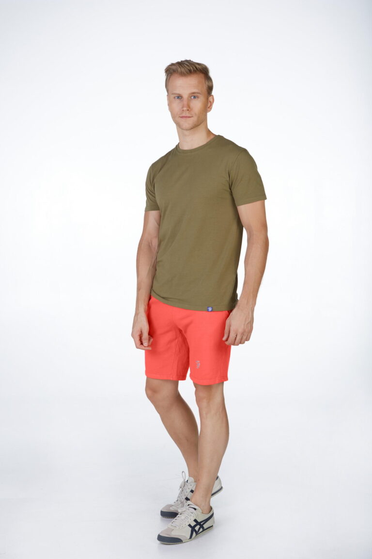
In the fashion world, combining 2 complementary colours is like creating a contrast. For example, to associate a Khaki piece with a red piece, as well as for a green piece associated with a pink piece.
Unlike the two previous associations (Monochromic and Shades), the choice of a contrasted design will give an effect cut and therefore a slightly more compact silhouette. This technique is not recommended for small people.
TYPES OF COLOURS
To be able to match the right colours together, it is also essential to know the types of colours. There are 5 of them. These types of colours will help you to understand the colours to match and to be creative.
Basic colours
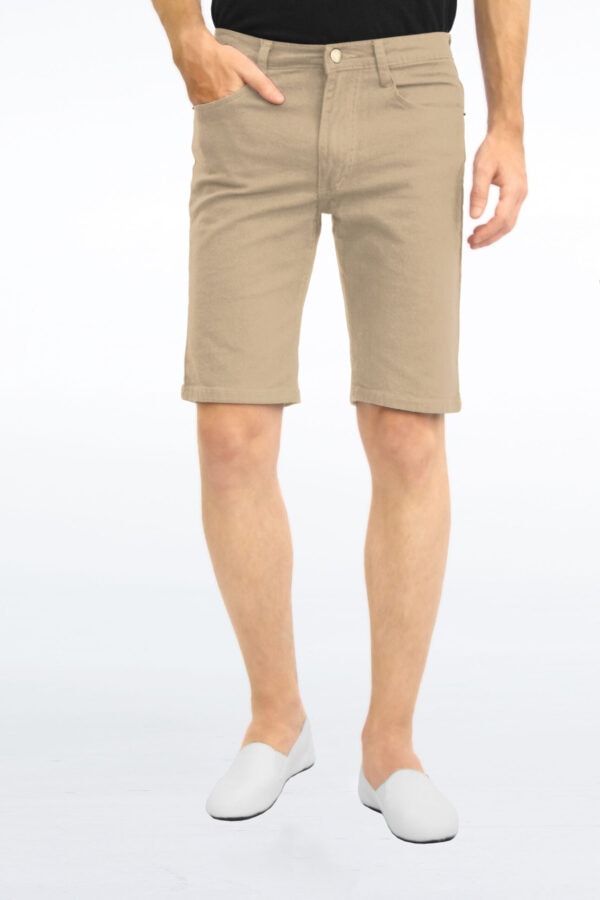
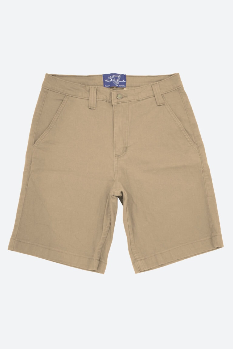
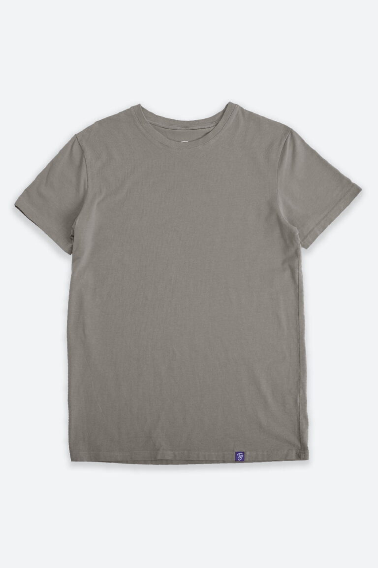
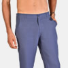
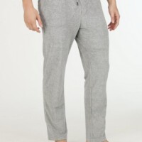
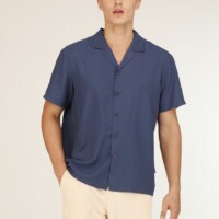
Without risk of making a mistake of taste, the basic colours are colours mat, called timeless. The main advantage of these colours is to soften the stronger colours (to discover below). List of basic colours: navy blue, gray (light or anthracite), cream, beige and its darker derivatives.
These links show you all our products in the presented colors
Halftone colours
The so-called halftone colours are between the basic colours and the strong colours (paragraph just below). These colours will make the balance in your outfits and can be worn easily.
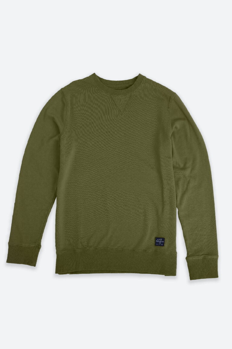
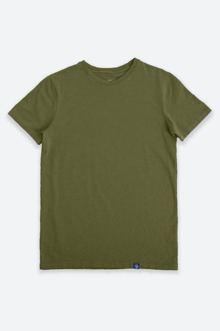
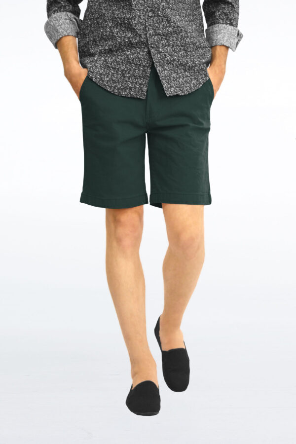
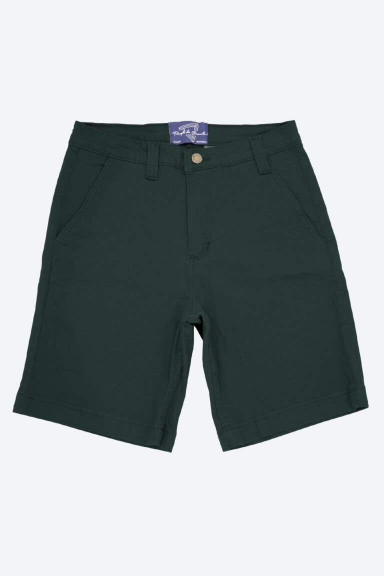
Some examples of halftone colours: khaki, petrol blue, blush, forest green…
These links show you all our products in the presented colors
Strong colours
Strong colours are those that will give a character to your outfits. The intensity of these colours is such that it is advisable to wear only one in monochrome or to associate them with basic colours.
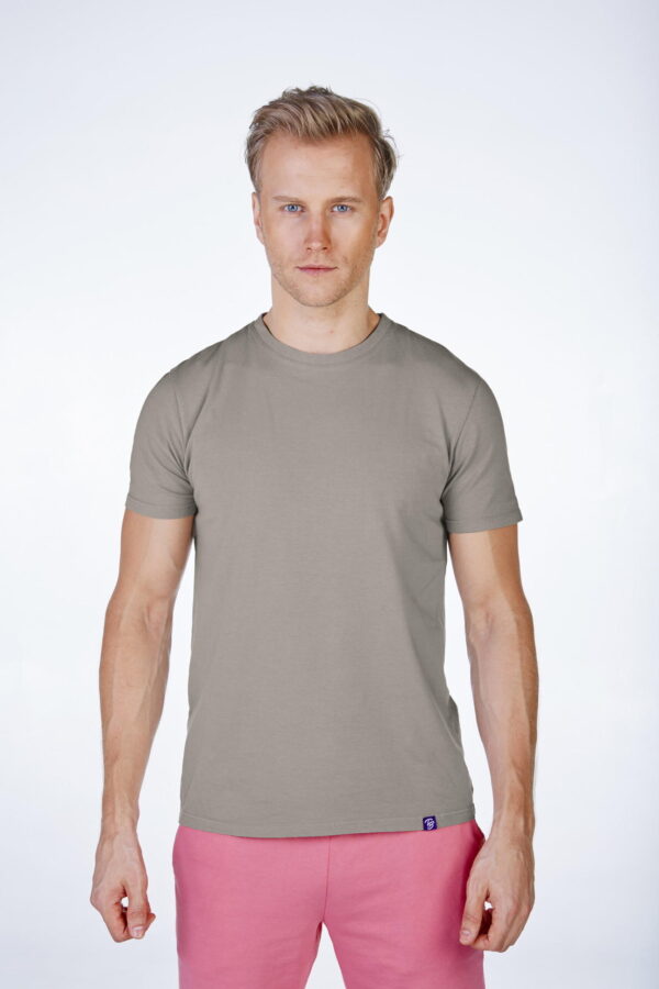
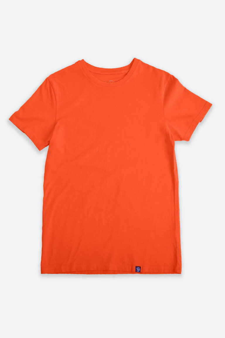
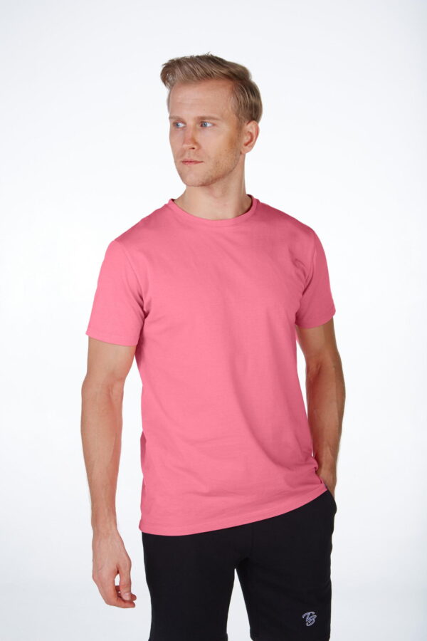
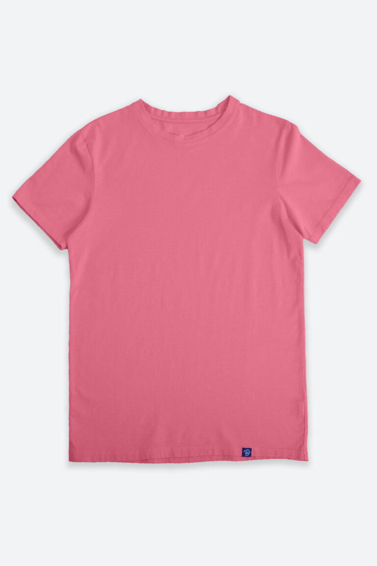
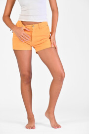
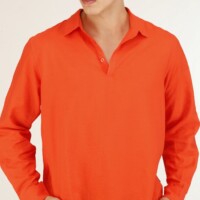
List of strong colours: red, pink, green, orange, yellow, coral, electric blue and purple.
These links show you all our products in the presented colors
Pastel / neutral colours
These are the colours that will bring sweetness to your style. These colours are usually worn white for a look while lightness and purity. To be associated also with each other or with the basic colours. The colours involved are: pastel pink, pastel yellow, pastel blue, pastel green …
These links show you all our products in the presented colors
Non-colours: black and white
Black and white are called “non-colours” or neutral colours. Black aims to stabilize while white is used to illuminate. It is often recommended to use these colours sparingly. A look all in white can be an option if it is totally assumed (or special evening “white”). White can associate with all colours. Black, cannot be complementary with all colours. Find some tips below on associations to avoid.
These links show you all our products in the presented colors
OUR 5 TIPS
1. The right colours in the right place
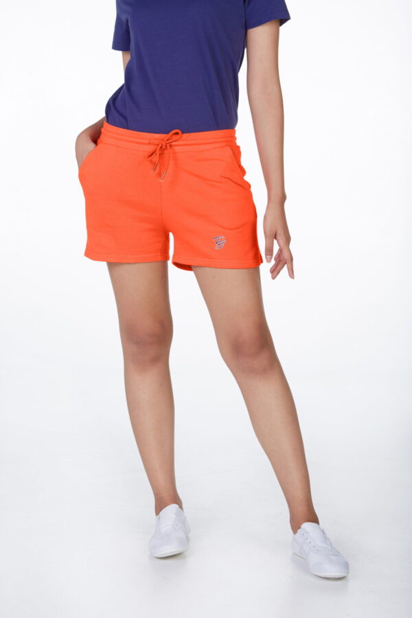
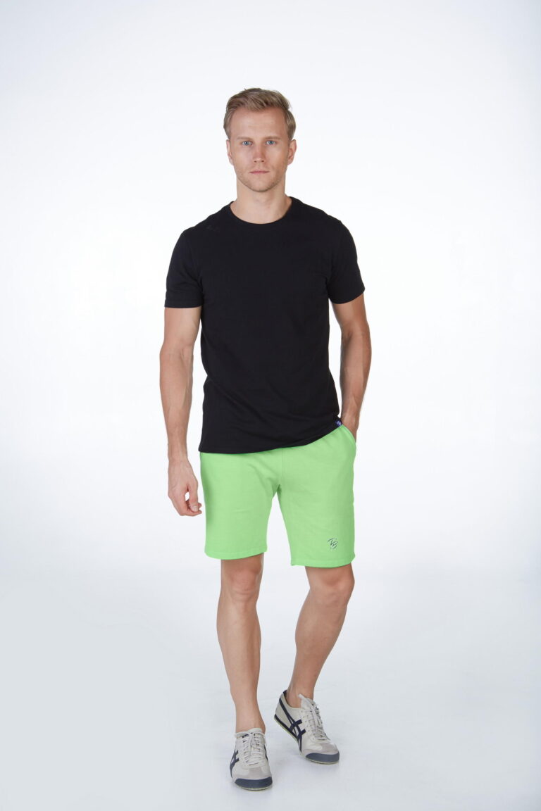
One of the basic and risk-free rules is to put the darkest colours on the pants / shorts. The strongest or brightest colours will be ideal for your tops.
2. Not more than 3 colours
Why not exceed 3 colours? Simply because if you go beyond that, it becomes very complicated to manage. As a result, your outfit will probably be out of balance. So be sure to remember this: no more than three colours! To have a perfect balance with your 3 colours, it is advisable to combine two strong colours with a basic colour or vice versa.
3. Rely on the colour contrast
For that, take again the chromatic circle that we developed above. Take the circle again and choose colours that fling aside each other to create the perfect colourful style. As a reminder, green will fling aside red, blue will fling aside orange and so on …
Tip: Wear the light shade on the area you want to highlight. Conversely, use a darker colour for the part to hide.
4. Technique of Shades
As explained above, the technique of shades (a mixture of colours with close shades) will give you a slim and elongated silhouette. Very simple technique that will give you a chic look while using multiple colours.
5. Triadic colours
This technique is based again on the chromatic circle that we have already seen several times. But here, the tip is to find three colours that are at the same distance from each other. So, you must imagine or draw a triangle with three equal sides (equilateral triangle) to determine your triadic colours. The three points of your triangle will select the winning trio. A classic example: yellow, red and blue. Effective method to wear a bright and colourful outfit.
From the beginning of this article, we put forward good advice as well as good associations … but it is important to know the associations that are to be banned. Here are some examples of bad colour combinations:
Red + Pink | Navy blue + Black | Blue + Green | Brown + Black | Purple + Plum
THE RIGHT COLOUR MATCHING
Now that you know the different matching techniques as well as the types of colours, you can perfectly combine your favourite colours for an inspired and chic summer look. Here is a list of several good associations:
- Beige: to associate with pink, dark green, blue, purple
- Electric blue: to associate with beige, light brown, gray, silver tones
- Navy blue: to associate with beige, brown, gray, yellow, orange, green, red
- Lemon yellow: to associate with cherry red, brown, blue or gray
- Light brown: to associate with pale yellow, cream, blue, green, red
- Dark brown: to associate with lemon yellow, sky blue, apple green
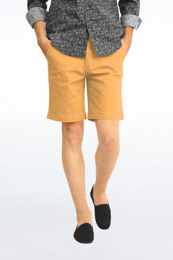
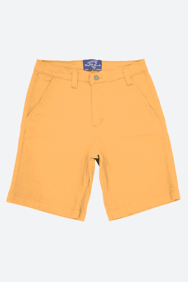
- Orange: to associate with gray, forest green, brown
- Pink: to associate with brown, water green, olive green, gray
- Red: to associate with blue, gray, pale yellow
- Turquoise: to associate with fuchsia, cherry red, beige, brown, cream
- Water green: to associate with brown, gray, navy blue, red, gray, beige
- Forest green: to associate with orange, light brown, beige
- Purple: to associate with beige, light yellow, gray, turquoise, water green
Despite all these fashion rules, do not forget to leave a little room for your creativity. Enjoy beautiful creations and new colours to express your mood. Let yourself be guided by your inspirations and realize your own associations for a totally personal and timeless style. Do not hesitate to write to us if you want help on this topic.
